
Spacing is crucial to web design and development–It is more than just empty gaps between elements.
When well-utilized, spacing is a powerful tool that can accomplish the following:
- allows elements to breathe, enhancing aesthetics and visual clarity
- aids in readability, giving the eyes a chance to rest
- makes it easier for viewers to digest information, reducing cognitive strain and enhancing comprehension
- is essential for good user interaction and accessibility by providing clickable areas with enough room to be easily tapped or clicked
- helps avoid accidental clicks and frustration, especially on touch devices
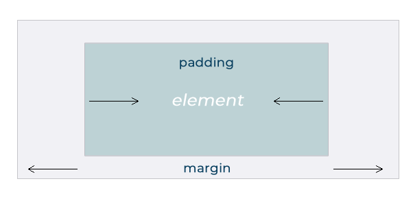
Two ways to create spacing on a web page are margins and padding. A margin is the area surrounding the border of an element, while the padding is the space between an element’s border and its content.
Margins & Padding: What’s the Difference?
While both margin and padding serve to create space, they each have distinct roles in the layout and presentation of elements on a web page. Because both options affect the overall spacing, it’s important to understand how they function so that you can use them accordingly.
Margins
As you can see in the image above, margins like to social distance. They dictate the space outside an element, influencing its relationship with neighboring elements. Margins are particularly useful for creating visual separation between elements, whether it’s to prevent them from appearing too close together or to introduce whitespace for a more balanced layout. Adjusting margins can help control the flow and spacing of content, guiding the user’s eye through the web page and emphasizing key elements.
For example, in a list of items, margins can be used to space the items evenly and provide visual cues for where one item ends and the next begins. Margins also play a crucial role in responsive design, allowing elements to adapt and maintain their spacing across different screen sizes and devices.
Padding
Padding, on the other hand, is like a hug. It defines the space within an element, acting as a buffer between the content and its edges. Padding ensures that the content within an element has room to breathe and avoids feeling cramped or constrained. By adding padding to elements such as text boxes or images, designers can enhance readability and visual appeal, making the content more inviting and user-friendly.
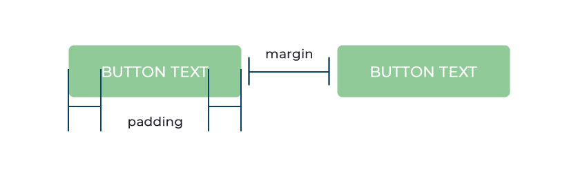
With buttons, for instance, padding is often used to give the text or icon inside the button some breathing space, preventing it from appearing too close to the edges. This not only improves the aesthetics of the button but also makes it easier for users to interact with it, reducing the risk of accidental clicks or taps, as the graphic below illustrates.
By understanding the distinct roles of margins and padding, you can elevate the aesthetic and functionality of your web pages. Whether it’s maintaining readability, enhancing visual clarity, or optimizing user interaction, strategic use of margin and padding is essential.
So, next time you’re fine-tuning your web layout, remember: It’s not just empty space – it’s the breathing room that transforms a good design into a great one!


