
Bigfoot Outrigger Pads Case Study
Project Info
Introduction
Bigfoot Outrigger Pads: Where Marketing & Manufacturing Meet in Industrial Web Design
In December 2022, Green Closet Creative launched a newly designed and developed website for our client, Bigfoot, a manufacturer of outrigger pads. The client had been working with a legacy firm for many years, and we were asked to provide a fresh set of eyes. Bigfoot leveraged our GCC marketing team that comprises 25 years of experience in manufacturing, Mike Blaser, and 20+ years experience in marketing, Darby Dwyer.
Flow of Information
We set out to organize the flow of information and clearly define what set Bigfoot’s products apart from competitive offerings. It was also important to define and address the various markets in which the products are sold and to differentiate which products are available for each market. Considerable content development was necessary to articulate the features and benefits of Bigfoot’s various product offerings. Because of the complexities of this project, our team gained valuable experience and expertise, such as incorporating WooCommerce, an e-commerce software solution, into the website.
Web Development
Cohesive Design & Product Placement
Consistency and consolidation are two key features of the industrial web design approach used for the Bigfoot website. Adhering to a consistent design throughout the site creates a unified online presence—no matter where a user lands, they know it’s Bigfoot Outrigger Pads. Consolidating each product on the homepage highlights all available options, while links to individual product pages provide the detailed information potential customers need.
Ease-of-Use
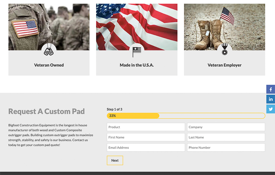
Placing the main products front and center on the homepage makes navigation intuitive for users. Each product is paired with its available optional features, helping visitors quickly understand their choices. To streamline the conversion process, a “Get a Quote” button is included beneath each product option, along with a persistent call-to-action in both the header and footer. These thoughtful choices exemplify effective industrial web design tailored to both usability and conversion.
Importance of Mobile
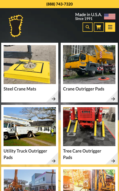
Every site should be responsive when it’s built. This site was no exception. But going beyond making the website responsive, we took time to think about the most important information being at the top of the mobile screen. The phone number is the first thing, followed by the iconic foot symbol, hamburger menu, and products right away. Proudly manufacturing their products in the U.S.A. and backed by decades of experience, their longevity is a cornerstone of the brand.
After – Mobile
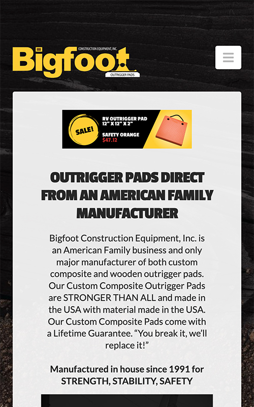
Before – Mobile
Speed Testing & Analysis
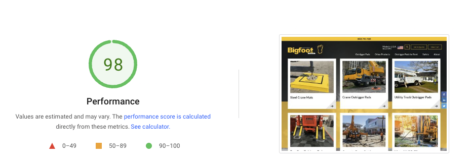
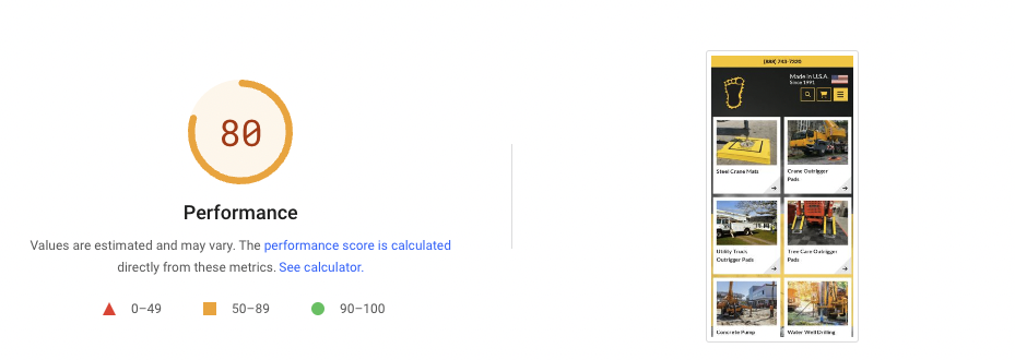
Page speed plays a critical role in SEO for manufacturing websites—the faster your site loads, the higher it can rank in search engine results and the more likely visitors are to return. Green Closet Creative excels at optimizing page speed to create exceptional user experiences and higher conversion rates for our customers.
Here’s a closer look at the speed test results for Bigfoot Outrigger Pads:
Desktop speed test results
Mobile speed test results
Graphic Design
Consistency Across Media
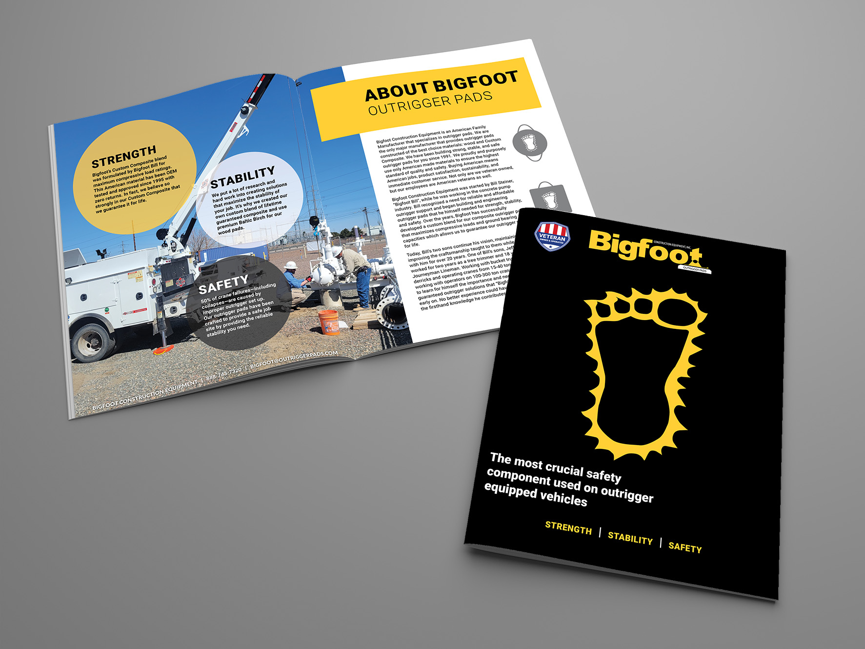
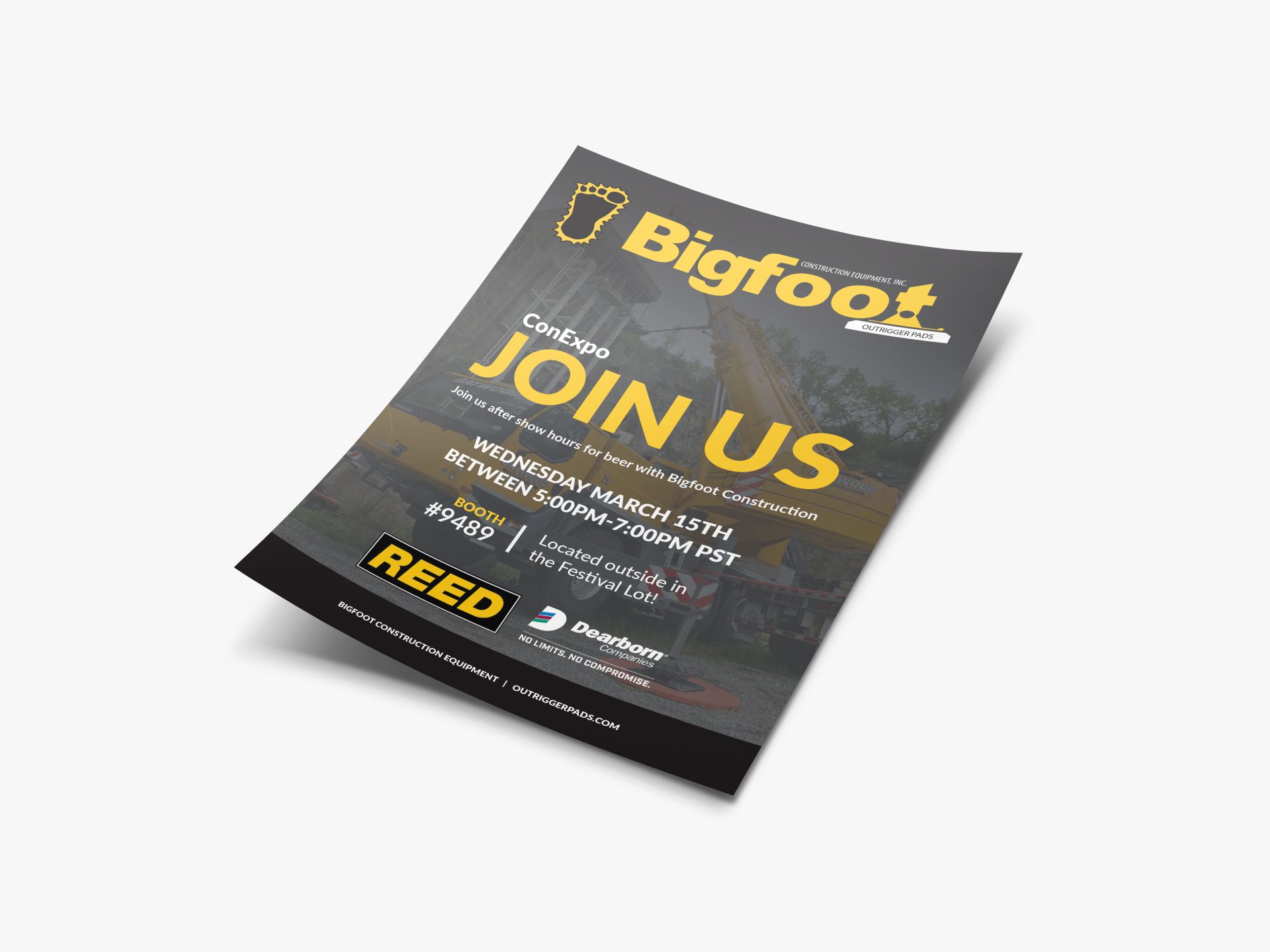
We understand the importance of maintaining a consistent brand look and feel across all marketing materials. When it came time to create a new brochure and sell sheets, it was essential that they visually aligned with our recently redesigned website.
To achieve this, we studied the design elements that contributed to the website’s success, including its color scheme, layout, imagery, and tone. These same elements were thoughtfully incorporated into the brochure design to ensure visual and messaging consistency.
Consistency was key to ensuring customers would recognize the Bigfoot brand and connect with its messaging across all touchpoints. By mirroring the website’s look and feel in the brochure design, we created a cohesive brand identity that strengthens marketing efforts and resonates with the target audience.
Results
Green Closet Creative partnered with Bigfoot to extend its refreshed digital brand into high-impact print collateral that supports sales and marketing efforts. By strategically aligning the brochure and sell sheets with the website’s visual identity and messaging, we created cohesive, on-brand materials that enhance credibility, reinforce brand recognition, and help Bigfoot connect more effectively with its target audience across multiple channels.
Looking to strengthen your online presence? Partner with Green Closet Creative for industrial web design that drives results.


