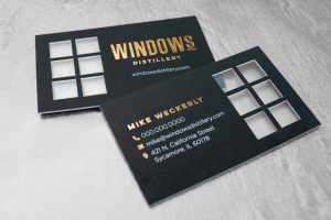
In graphic design, the goal is not to fill the page but to provide content in an easily digestible and visually appealing way. The “less is more” approach takes advantage of the design element of using white space – the negative space – to help guide the eye, balance the composition, create organizational hierarchy, and accentuate the design elements. Without the white space offered by “less is more,” the overall message of a brand can get lost in the clutter.
The Message Is Clear
Let’s say you’re designing a business card for a company. Think about how much time a person will spend looking at that card: a few seconds? Definitely under 15 seconds. Someone may only take a moment to glance at the card, but they still are absorbing important information.
Because the point of a business card is to quickly contact that person, you want to make sure the name, phone, email and website stand out and are clearly defined. Incorporating an eye-catching design is aesthetically pleasing and accentuates the contact information.
The Impact of Negative Space
Essentially, “less is more” is equivalent to “quality over quantity.” The success of this approach is based on utilizing the empty areas around or between design elements.
Less is more is effective in all design mediums, including websites, print and digital ads, and product labels. Examples of less is more graphic design elements include:
- Headlines
- Callouts
- Lists
These all help to effectively communicate your message by giving your viewer a break for the eyes amid the noise of information.
Examples
While we don’t work directly with any of these companies, we appreciate their aesthetic approach to using the white space as a design element. Two of the most successful examples of the less is more design approach are Apple and Nike. Similar to Minimalism design methodology, which takes the “less is more” approach to the extreme, these two companies take advantage of negative space to convey their message without the distraction of overcrowded layouts.
Fun fact: even Maximalism utilizes negative space! Here are a few fun, effective examples:
In these campaign concepts, the designs leave room for negative space, whether it’s white, black, green, or another color. Taking advantage of the negative space allows viewers to move smoothly through the design, even though there are a lot of images, making sure the main message comes across loud and clear.
Graphic Design For Your Business
By prioritizing the simplicity and clarity of the less is more approach to graphic design, you can create a visually appealing campaign that makes a strong impact and captures the attention of your target audience. Cleaner layouts, uncluttered messaging, and more focused communication of your key brand message all contribute to a successful brand strategy.
If you are looking for help with professional logo or brand development/refresh, we can help! Green Closet Creative offers a full range of creative services including print advertising, billboards, photography, websites, and more. Contact us to learn more.


